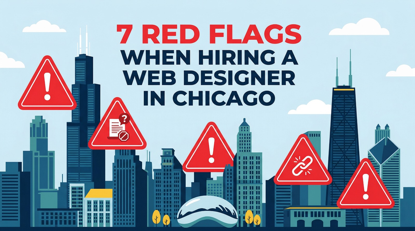
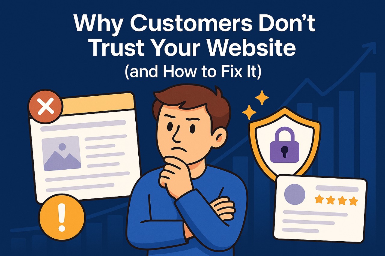
Why Customers Don’t Trust Your Website (and How to Fix It)
Trust is the invisible currency of the internet. Without it, even the best product or service fails to convert. Ads can bring people to your site, but if something feels off, they leave before you can explain your value. The goal of this guide is to show you what silently breaks trust and how to repair it with clear, practical steps.
Trust grows when your website looks current, speaks with clarity, loads fast, and proves results with real evidence. It weakens when design is mixed, messages are vague, prices are hidden, and security is shaky. The following sections go deep into each area and include a case study card and a fix card so you can act right away.
1) Mixed or Outdated Visual Signals
Visual signals are your first thirty seconds of trust. People scan the page and make fast decisions based on spacing, color balance, and image quality. If the design uses old gradients, random icons, or different button styles on each page, visitors sense disorder. Disorder hints at risk, and risk lowers conversions.
Strong brands build comfort through consistency. A steady type scale, a clear color system, and one style of imagery help users relax and focus on your offer. When the design feels modern and aligned, users assume your service is well run too.
Logistics Firm Rebrand
A B2B logistics firm in New York had great offline work but a site that looked 15 years old. We rebuilt the brand system, replaced stock photos with real warehouse images, and set a simple type scale. Lead form submissions rose 65% in 90 days and average session time doubled.
Design Consistency Sprint
Create a one-page brand sheet with fonts, colors, button styles, and spacing rules. Replace low-res images with branded photos or illustrations. Use a single CTA style across the site. Review the homepage on mobile and ensure the hero states one promise and one action.
2) Weak Messaging and Lack of Clarity
Visitors arrive with a question: what do you offer and why should they choose you. If your headline is clever but unclear, or your copy lists features without benefits, people feel lost. Confusion is the biggest trust killer because it makes users work to understand you.
Clear messaging is simple, direct, and outcome focused. It shows the problem you solve, the result you create, and how to get it. Support this with short proof lines and a visible CTA that guides the next step.
SaaS Demo Growth
A workflow SaaS had a stylish site but no clear CTA. We rewrote the hero to promise one result in plain English and added “Start Free Demo” at the top and mid-page. Demo signups grew 42% in four weeks and support tickets about pricing dropped because the message was clearer.
Message Ladder
Write a three-line ladder: Problem → Promise → Proof. Put it in the hero. Add three benefit bullets tied to outcomes. Keep CTAs consistent. Remove jargon and replace with everyday words your customers use in calls and emails.
3) Hidden or Confusing Pricing
People expect transparency. When pricing hides behind long forms or vague “contact us” pages, visitors fear a surprise later. Even if your work is custom, a range or starter package helps buyers feel safe enough to start a conversation.
Price clarity filters the right buyers and saves time for both sides. It also reduces drop-off from users who simply want to know “is this in my budget” before they invest more effort.
Agency Lead Quality
A creative agency saw many inquiries but few qualified. We published three service tiers with “from” prices and a simple scope table. Inquiries fell 18% but qualified leads rose 58% and the close rate improved because expectations were set early.
Pricing Clarity Pack
Create a pricing page with ranges, inclusions, and add-ons. Add an FAQ that explains timelines and payment terms. Place a small note that custom quotes are fine when projects fall outside the tiers. Link the pricing page from every service page.
4) Lack of Proof and Social Validation
People believe other customers more than they believe brands. If your site lacks reviews, case studies, and real examples, the safest choice for a visitor is to leave. Proof reduces risk and gives buyers a story to imagine their own success.
Use proof in layers. A short quote near the CTA, a detailed case study on its own page, and a portfolio grid that shows range. Real names, roles, and clear results make proof feel true.
Home Services Lift
A local plumbing brand embedded Google reviews on the homepage and added three short “before and after” photo stories. Booking conversions rose by 31% and phone calls increased because visitors could see real outcomes from nearby homes.
Proof Stack
Collect five client quotes with permission. Build one full case study with problem, plan, and result. Add a lightweight portfolio grid. Place star ratings or platform badges close to CTAs for extra confidence.
5) Technical Red Flags and Security Gaps
Most visitors cannot read code, but they notice warning labels and broken journeys. A “Not Secure” tag, a 404 page during checkout, or a form that never confirms submission signals risk. People will not trust you with their data if the basics feel shaky.
Strong security is also part of good user experience. When forms validate smoothly, when pages do not flicker, and when payments confirm quickly, buyers feel safe and in control.
Checkout Recovery
An online jewelry shop had mixed content errors on the cart page and no clear success message after payment. We enforced HTTPS, loaded assets from a single domain, and added a proper receipt screen. Completed orders rose 35% and chargeback disputes dropped.
Trust Tech Checklist
Enable SSL on every page. Update CMS and plugins. Add privacy, refund, and shipping pages in the footer. Show trusted payment marks at the cart. Test all forms and send a friendly confirmation with next steps.

6) Content That Feels Generic
Thin or recycled content hurts trust and search visibility. Visitors want to learn from you before they hire you. If your blog repeats surface tips or your service pages copy what competitors say, people doubt your depth.
Authority grows when you publish guides that show your process, name common mistakes, and explain costs in simple language. Depth builds confidence and positions you as the safe choice.
Expert Guide Wins Leads
A commercial cleaning company wrote an in-depth guide on “How to compare cleaning contracts.” The article ranked locally, and sales calls started with warmer questions. Lead quality improved and close time shortened because trust was built before the call.
Content Depth Plan
List the top five buyer questions from sales calls. Write one detailed page for each. Add photos from real work, a short checklist, and internal links to services and pricing. Update older posts with fresh facts and examples.
Frequently Asked Questions (FAQs)
What are the quickest changes that improve trust?
Fix SSL issues, clean the hero with one clear promise and one action, add three real testimonials near your form, and compress images to speed up loading. Small changes here create an instant lift in comfort.
How do I decide between a refresh and a full redesign?
If issues are cosmetic only, a refresh of fonts, colors, spacing, and CTAs may work. If navigation, templates, and speed are all weak, a full redesign is more cost-effective and easier to maintain long term.
Do I need to publish prices if every project is custom?
Publish ranges or starter packages. This sets expectations and attracts serious buyers while still allowing custom quotes for unique work.
Where should I place reviews for the best impact?
Add a short review near your main CTA on the homepage and service pages. Link to a deeper case study for readers who want details. Use the same voice and keep the quote specific to the outcome.
Conclusion
Trust is earned through many small signals. When design is consistent, messages are clear, prices are open, proof is visible, tech is stable, and content teaches with depth, visitors feel safe to take the next step. If you want a partner to plan and ship these upgrades with care, Seven Seas Web Design is ready to help.